Worse than Yelp reviewers 🤮
Put a logo on the internet and people will bash it without fail
Slack’s logo redesign is S-tier. The internet decided it was ducks sniffing each other. Only one of those is a review of the work.
Put a logo on the internet and people will bash it. Without fail, every time, no exceptions.
Slack is the one I keep coming back to, because, even years later, people still argue about it.
The internet decided the new mark was a bunch of ducks sniffing each other’s butts. Then it was a set of rotating phalluses. Then it was a colorful swastika.
And it leaves me scratching my head, are they even seeing what I'm seeing?
Here’s what the work actually was
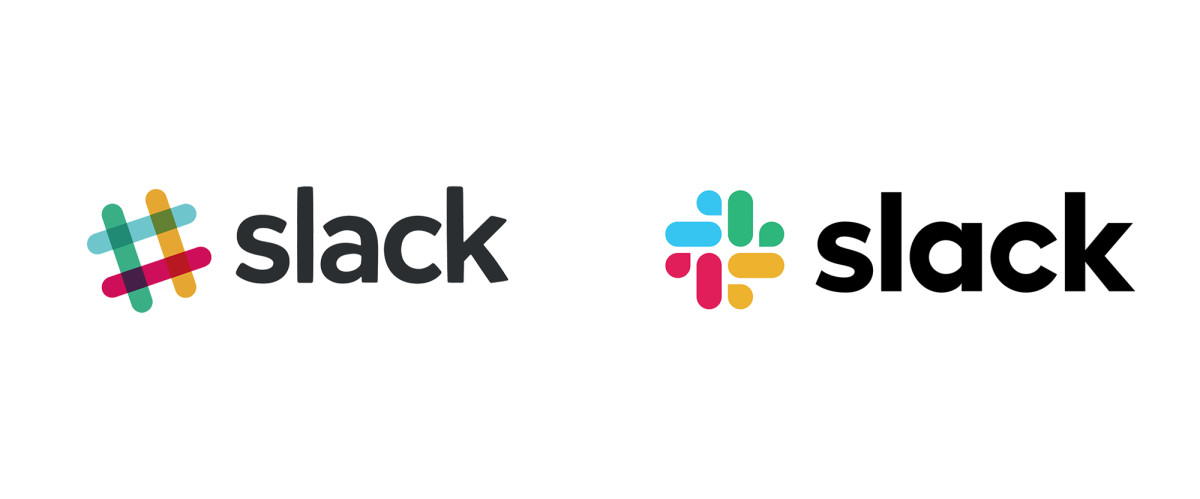
The old logo looked good at a glance and was a nightmare in practice.
Eleven colors, and not eleven colors anybody sat down and chose. The mark was built out of overlapping translucent shapes, so every single intersection generated its own unique color as a byproduct.
Which meant it was extremely hard to reproduce accurately.
It only worked on white.
No dark mode.
Nothing on a multicolored background.
And the typeface underneath it was casual in a way that never quite arrived at polished.
Pentagram fixed all of it. A clean geometric sans that’s genuinely legible, and an icon that holds up in light and dark. They kept the palette, because the palette was never the problem, and simplified the mark down into overlapping speech bubbles.
The shape references channels and conversation, it scales cleanly, and it expands out into a full brand motif across their marketing instead of just sitting there being a logo.
Animation, illustration, the whole system, no friction, no angry marketing team annoyed with handling this mark.
For me it’s an S-tier redesign. It solved important problems and came out more distinctive and more ownable than it went in.
Oh, and the company wearing it got acquired for $27.7 billion.
So what's the deal with the people who bashed it?
The haters are just like Yelp Reviewers
You know the review. "One star. Took forever to find parking."
Nothing about the food, nothing the kitchen can use, nothing the owner can fix, and it sits at the top of the page for years because the platform pays out for heat and not for accuracy.
Design criticism online runs on identical economics. “They solved a reproduction problem across every surface they ship on” travels nowhere. “Ducks smelling butts” or "vibrant swastika" travels everywhere. S
o the comparisons get more strained every cycle, because the easy resemblances were all claimed years ago and the ones left over require real contortion to reach.
Point being, they’re not reviewing the logo. They are just looking for something to complain about, grow their following, and throwing the baby out with the bath water.
Grade the tool
Does it hold at sixteen pixels? On black? In one color? In motion? On a shirt, in an embroidery file, in an app icon sitting next to fifty others?
Does it feel like them?
Every one of those has an answer. “It looks like something” isn’t a question, it’s a Rorschach test, and the only thing it ever tells you is something about the person taking it.
A logo is a tool, not an art piece, and you grade a tool on whether it works.
Next time a rebrand gets dragged, go pull up the old one before you read a single comment.
— Zach 😎