Your rebrand is already on your Spotify 🤘
Seven brand assets hiding in plain sight, and where to find them on an album cover.
Corey’s brand, CF’s palette, and my logo all came from album covers. Here’s how to go hunting.
Most of the time my job is to make things look nice. Other times I think the core of my job is helping people see and appreciate the beauty that’s right in front of their nose, especially the things that they’ve already come to love.
You probably listen to music on a daily basis, if not semi-frequently. When was the last time you stopped and actually looked at the album artwork and seriously thought about the attention to detail and effort and intention that went into making that visual representation of an artist's music?
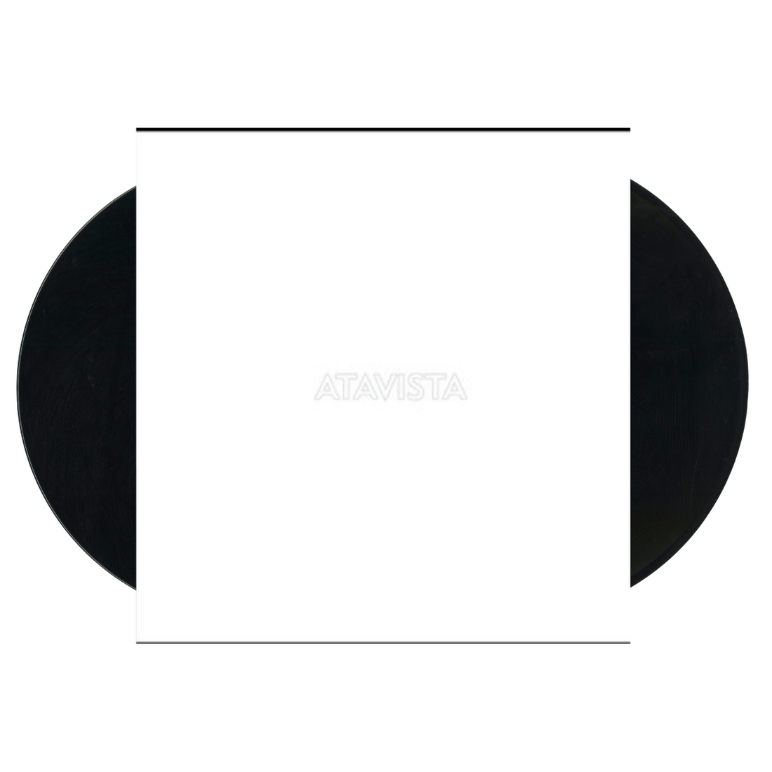
It’s worth doing, because some of the brands I've made started right there. My co-founder Corey’s entire brand was built off Atavista by Childish Gambino. The color palette for Conversion Factory came from Kanye’s Jesus Is King. And my own logo came from Black Flag. Their logo is four bars, so I figured if they can do four, I can do just one and put a Z inside of it.
Atavista
Corey's Stylescape
Jesus is King
Conversion Factory Website
Damaged
ZSTVNS Logo
None of those were hiding or esoteric, reserved only for the worthy few. No, they were sitting in plain sight, and the only thing that changed was how closely we looked at them and appreciated them.
Every cover is hiding a few of the seven design assets every brand should be utilizing, the same parts that make up a creative direction: color, typography, photo styling, illustration, icons, the logo, and pattern and texture. Most records hand you two or three, and that’s plenty.
You’re not stealing the cover. You’re on a scavenger hunt for extractable assets.
Here’s what I found in my own stack (yes, Ed Sheeran and Metallica live under the same roof).
1. Color
Look for: which colors sit together, and the mood the pairing creates.
Lifting a palette straight off a cover is totally fine. Take a photo of it, drop it into your AI agent, and have it build a palette for you. You’ll get some combinations you’d never have landed on yourself and it will be different from the cliched burnt orange + cream supplied by Claude or the bullshit gradients every amateur startup one-shotted.
The bigger payoff is seeing how colors work together, and which blends make people feel what you want them to feel. Oingo Boingo’s Nothing to Fear is a saturated green and red because Oingo Boingo is a vibrant, saturated, slightly off-putting band.
Ride the Lightning is almost entirely one electric blue, cold and charged.
James Taylor’s Greatest Hits strips the color out completely: a cream sleeve and almost black type, about as calm as a record gets. Line those three up and you can feel the mood each combination makes before you’ve picked a single hex code.
2. Typography
Look for: the type, and how the pieces play with each other. Check the inside of the jacket too, that’s where a lot of it hides.
Open up Hotel California and there’s a really unique script on the inside of the jacket. Pull it as an accent for a few key moments, and see how it plays against something more stripped down, like the plain serif on that James Taylor record.
Or look at the typewriter text on Sheeran’s x, which would make a great accent or headline typeface.
Sometimes you pull one typeface. Sometimes you pull a pairing, or mix from different sources.
And if you spot a typeface you love, take it. Find the closest match you can, and as long as it fits the vibe, put it straight into your palette. Nobody else in your market is pulling type off a 1976 Eagles record, which is exactly why it’ll look like nothing else in your category.
3. Photo styling
Look for: the light, not the subject.
For Hotel California, photographer David Alexander and art director John Kosh went up in a 60-foot cherry picker over Sunset Boulevard and shot straight into the sun on high-speed film, which is where the grain comes from. The direction wasn’t the hotel, it was the hour, the angle, and the film grit. Most brand guidelines say “authentic, natural lighting,” which describes every stock photo ever taken. Steal a vibe instead.
4. Illustration
Look for: how it was made, not what it shows.
The skeletons on Dead Man’s Party aren’t drawn. They’re clay figures, staged at a party and photographed. Or the cross hatched, pencil sketches ont he inside of Ed Sheeran's x... Even crazier is the acid-trip inside Pink Floyd's The Wall.
Master of Puppets goes the other way, a painted field of white crosses on puppet strings under a blood-red sky. In a world where every SaaS illustration is the same Corporate Memphis person with noodle arms, finding a more obscure, authentic illustration style is a breath of fresh air and it shows how much you're paying attention.
Worth adding that with the advent of AI generated imagery, this is so much more attainable if you're willing to consider a unique approach.
5. Icons
Look for: a single symbol that holds up on its own at any size.
Ed Sheeran’s records are a +, an x, a ÷, an =, and a −. Five albums over twelve years, one symbol each, and you can spot any of them from across a record store. Mine’s the green x, and it isn’t a clean geometric glyph, it’s a rough black brush mark. Your icons don’t have to be one-pixel line art. They have to be drawn the same way every time.

6. The logo
Look for: what the mark says about who they are, and who they aren’t.
For Van Halen’s first record, the label mocked up a jagged, abrasive logo. The band hated it, and Dave Bhang drew the winged VH instead, partly to make it clear they had nothing to do with punk. That’s a logo doing positioning work making sure the band isn't mislabeled as "too punk."
Then look at Metallica: Ride the Lightning and Master of Puppets look nothing alike, and the same logo sits at the top of both and has become a recognizable symbol worldwide thanks to consistent usage.
7. Pattern and texture
Look for: the thing in the background you’d notice if it went missing.
The Wall is the obvious one, a single repeating brick committed to so hard that the original pressings had Pink Floyd's logo tear off with the cellophane wrap. The floral border on Dead Man’s Party becomes a pattern system the second you pull it off the lyric sheet.
And the green behind Sheeran’s x isn’t flat, there’s grain under it, as is the linen texture of James Taylor's Greatest Hits.
An underrated, ever present element that can help tie disjointed touchpoints together without being abrasive or requiring a slapped on, afterthought logo placement.
Next time you open Spotify, stop scrolling past the covers. Pick a jam you’ve had on repeat, and look at the album art. What strikes you about it? Can you find anything interesting that you could use for your brand? Or maybe it's nothing at all and you can move on. You will never know until you look.
I guess, if I was to put a larger, more existential pin in it, you have to seek out visuals that carry an emotional resonance if you want to build a killer brand. Because without it, you rob yourself of building a library of visual assets that you can blend and mix at your leisure to create something unique. Instead, you'll be relegated to same Dribbble shots as everyone else.
All it takes is 5 minutes of really looking at something to experience its significance.
— Zach